To help you do a quick check of a web page for the most common accessibility errors, we have a visual tool called Tota11y. It won't catch every problem, but it will catch the most common problems that we find on Babylon sites, and highlights them in your browser window, so you can check pages while you're editing content, before they ever go live.
Drag this link to your Firefox/ Chromium/ Safari bookmarks bar:
Tota11yClicking this button in your bookmarks bar will summon Tota11y to the bottom left of the webpage you're currently on. (You may have to accept cookies or otherwise dismiss any banners that appear on the bottom of the page if they are obscuring the Tota11y icon.)
Clicking this icon will expand the menu:
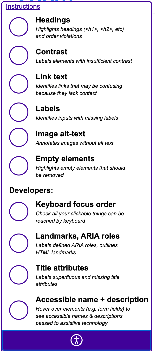
If the expanded menu is obscuring some information, you can shrink it again by clicking the icon.
The bookmark button injects Tota11y into the current page. If you refresh it, or navigate to another page, you'll need to click the bookmark button again. To remove the Tota11y menu, refresh the current page.
Instructions
The menu is split into two sections. The upper section is mostly applicable for content editors, and the lower section for 'developers' (i.e., people with control over HTML blocks and form fields).
Headings
A good heading structure is vital for people using assistive technology such as screen readers. The first heading on a page should be an <h1>, and after that there should be a logical hierarchy, with no heading levels skipped.
Selecting the 'Headings' option from the menu will show you the headings hierarchy of the page in an accompanying info panel (you can drag the info panel by its top title bar if it's obscuring content you need to see):
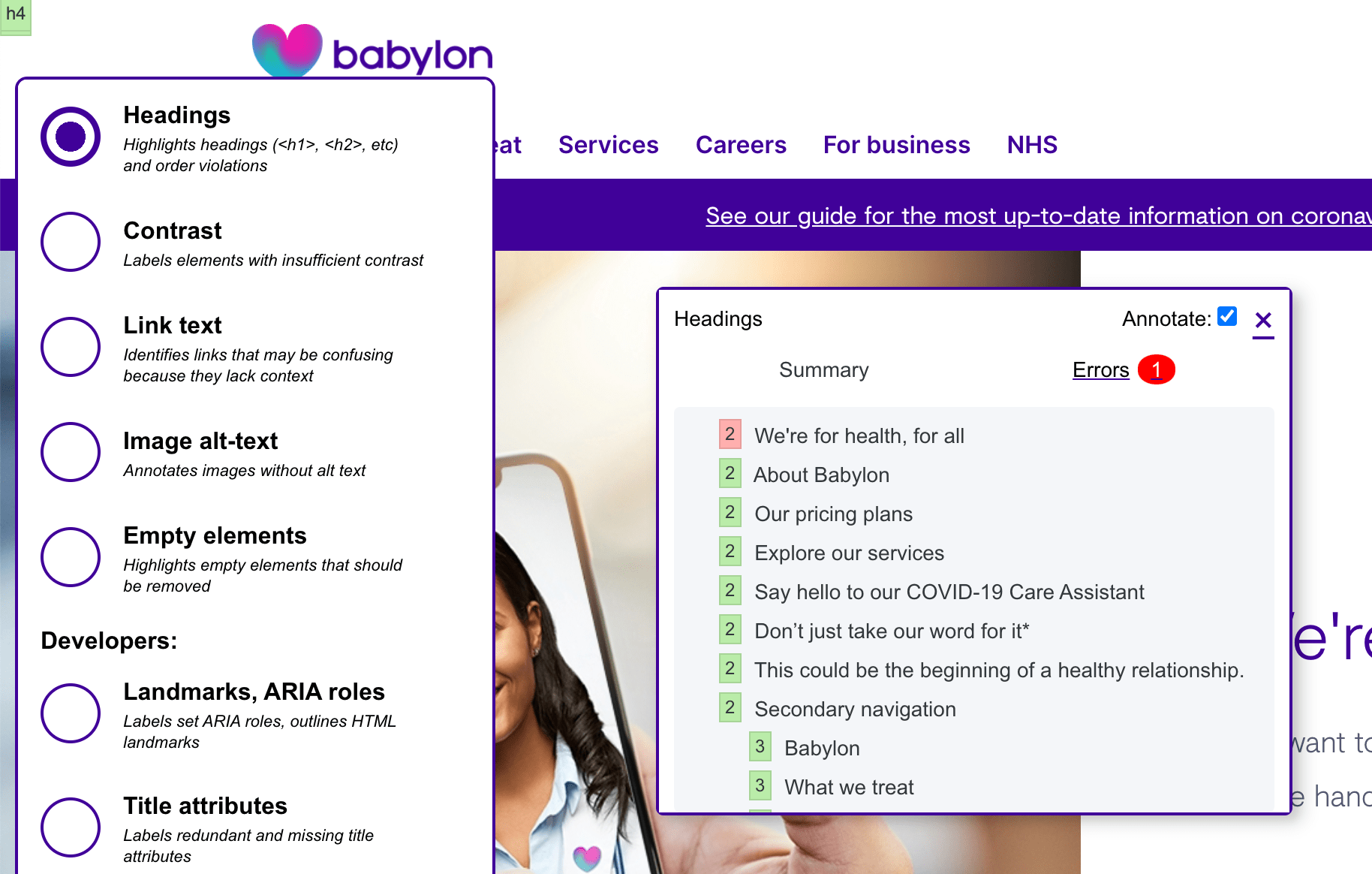
The info panel shows that the headings hierarchy is incorrect; clicking "Errors" will give further information–in this case, that the first heading is not an <h1>. The relevant code is displayed:
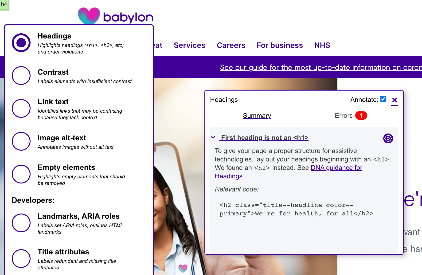
On the top right of the error explanation you'll see an icon called the "sniper rifle sight thing that Jack Roles made"; clicking this will take you to the actual error on the page:

Contrast
Insufficient contrast was reported as a problem by 56% of disabled web users in a 2019 survey. The rules for contrast are relatively complex (it depends on the size of the text, its opacity and so on). Tota11y will check text against its background colour, but it doesn't analyse pixels, so isn't able to check text that overlays a gradient, pattern or an image (but we shouldn't really do that, anyway).
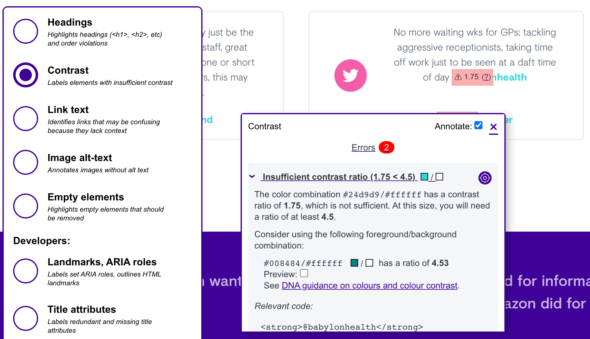
Choosing the Contrast option will overlay green or red indicators. A green overlay shows adequate contrast (and its computed ratio);

Areas with inadequate contrast are highlighted in red. The Info Panel will suggest combinations near to the current colours which have an adequate contrast ratio:
Link text
77% of screen reader users reported poor link text as a problem for them. It's important that the same text doesn't link to different places, and that link text gives an idea of where the link will take them, as keyboard users can tab from link to link—if each link reads "click here" or "read more", it's not helpful.
This menu option checks link text against a dictionary of commonly used phrases such as these.
If you want to check that links aren't broken, this can't be done from a bookmarklet. This Link Checker Chrome extension will check all the links in the current page.
Image-alt text
"A picture is worth a thousand words" goes the old saying. But for someone with low vision, or on a very slow device, that picture may not be visible, so it needs alternate text to describe it.
<img src="weasel.png" alt="an angry weasel dancing
flamenco">
(Note that we don't prefix it with "image of" or "picture of" because assistive technology will do that automatically.)
Images that are purely decorative or which repeat information already presented in textual format (for example, a pie chart that reinforces the text of an article), the alt text can be blank (opening and closing quotes without content):
<img src="purely-decorative.png"
alt="">
In the case of images which are links, for example, the Babylon logo in the website header which links to the home page, the alt text should describe the destination, not the image:
<img src="logo.png" alt="Babylon Health
homepage">
The image-alt text option of Tota11y will check that each image has
alternate text. Images without alt text will be highlighted in red,
indicating they must be corrected before the page is made live. (This
example is not from Babylon as I couldn't find one, luckily. The
developer should duplicate all the text in the image as alt text:
alt="Acute (short term) medicines …")

Any image it finds with blank alt text will be marked as "decorative". It's up to you to verify that the image is actually decorative so doesn't need alternate text.

It can't verify that any text it finds is useful, but will ask you to check that by hovering over the yellow warning. Here's an example of bad alternate text:
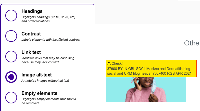
This text doesn't describe the image in a useful way, and should be rewritten before the page is made live.
Empty Elements
When we remediated the marketing sites in 2020, we noticed lots of empty
headings, or multiple <br> elements, presumably for
spacing. Empty headings might be announced to assistive technology users
(depending on the screen reader and user settings) but offer no further
information (because they're blank), and so will be confusing and give
a worse experience.
Multiple <br> tags are shown in yellow as a warning, as
they won't hurt user experience (but which may indicate that the
component needs some designer/ developer love):
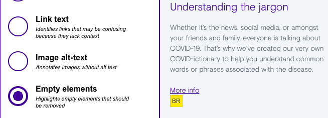
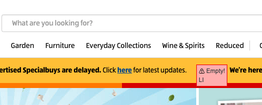
Here, an empty <li> tag (not on a Babylon site!) is
shown in red as an error, because it will confuse a screen reader user.
This should be removed before the page is made live.
Developer Modules
These modules are primarily for developers, those who create and amend components. There's nothing to stop you using these modules to investigate a page, but note that you may not be able to make any necessary changes (but please let a developer know so they can do the work!)
Focus Order
This plugin will guess at the computed tabindex of each
interactive element (links, form fields and summary elements.
(The order is not guaranteed, due to
under-specification of tabindex,
different browser behaviours, and also clickable things in iframes). Verify any weirdness by simply
advancing through the page with the 'tab' key.
As details elements can contain interactive elements, these
will be programmatically opened and given a green border.
If anything on the page is clickable but does not have a tabindex, it cannot be foussed with the keyboard and is therefore inaccessible.
Landmarks, ARIA Roles
This module outlines and labels HTML5 landmark elements that can help assistive technology users understand and move around a page.
It also exposes authored ARIA roles, so you can check whether a role is overriding the intrinsic role.

Title attributes
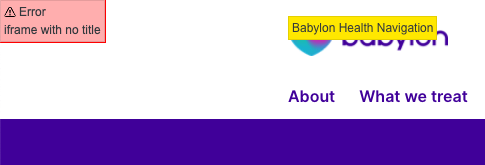
Nothing on Babylon sites should have a title attribute, due
to its historical mis-use to placate the false idols of Search Engine
Optimists (see
The Trials and Tribulations of the Title Attribute. The only exception for <iframe>, where it's
required. This module exposes titular naughtiness; red for errors which
must be corrected, amber for superfluous titles which
should be removed when possible.
Accessible name + description
This module allows developers to hover over form input fields and see
authored information that is passed to assistive technology. (Other
information, such as whether the field is required, disabled, checked, or
selected may also be communicated to the user, depending on the screen
reader). Note that this module is currently in beta and
needs to take account of fieldset and legend
(especially the latter with aria roles).
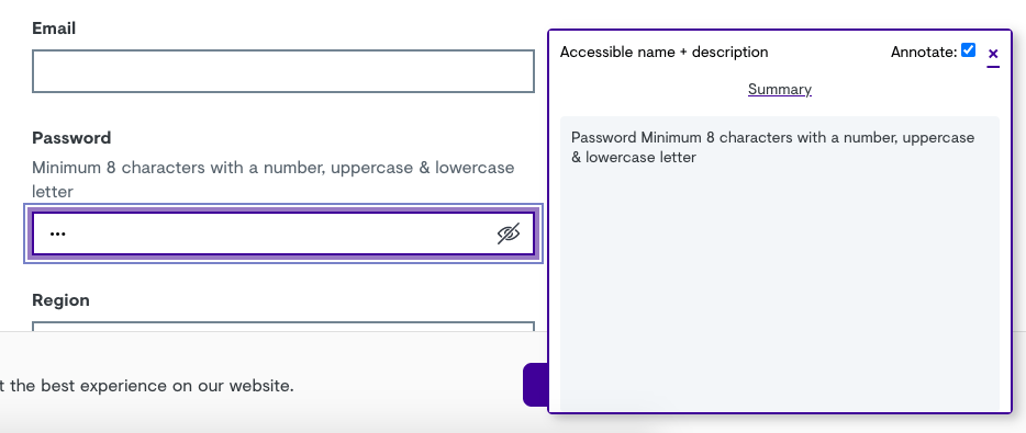
The primary use of this module is to verify that every input field
(whether textual, a radio button or a checkbox) gives enough information
so someone who can't see the label is able to fill it in. In the
example below, a blind user navigating a page with the keyboard uses the
tab key to move between form fields, and bypassing the visible
labels. The label and the instructions are passed to a
user, because they are part of the <label> element or
associated with an aria-describedby attribute, for example.)
